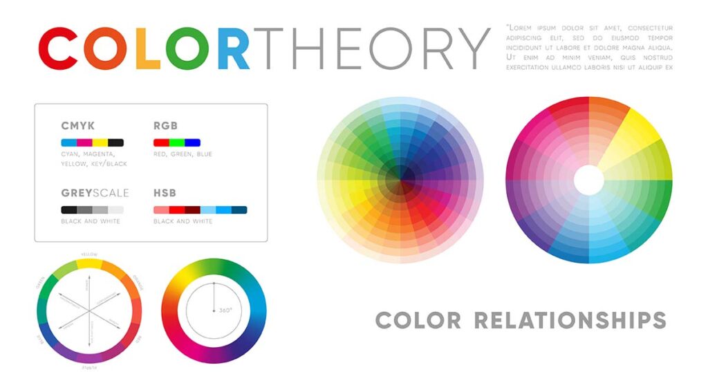
A Comprehensive Guide to Color Theory in Graphic Design
Graphic design is more than just arranging visuals on a page or screen—it’s about creating meaningful connections with an audience through imagery, typography, and most importantly, color. If you’re pursuing a career in graphic design or seeking to refine your skills, a deep understanding of color theory is essential.
Colors play a significant role in evoking emotions, enhancing brand recognition, and influencing user behavior. Whether you’re designing a logo, a website, or a print advertisement, mastering the principles of color theory will elevate your work and set it apart from the competition.
In the following guide, we delve into color theory’s basics, explore its practical applications in graphic design, and conclude by presenting some advanced techniques to help you create impactful, visually stunning designs.
What is Color Theory?
At its core, color theory is about how colors interact with each other and how they affect the viewer. It entailed principles meant to guide through the choice and combination of colors to achieve visions of harmony and elicit emotions.
In graphic design, color theory plays an important role when deciding on branding, layouts, and visual storytelling. Understanding how the perception is affected by a color will allow designers to create visuals that relate to the audience and achieve the desired outcome.
The Building Blocks of Color Theory
To understand color theory, one needs to learn about three fundamental properties of color:
Hue
Hue is the name of the pure color, red, blue, or yellow. It defines which color family it belongs to and, often, what’s in people’s minds when thinking about a color.
Saturation
Saturation refers to the intensity or purity of a color. Very saturated colors are rich and saturated, while desaturated colors are less rich and washed out.
Value
Value refers to the lightness or darkness of a color. Adjusting the value of a color creates contrast, depth, and emphasis in design.
These properties compose the entire range of colors and affect how colors are perceived.
The Color Wheel: Your Essential Tool
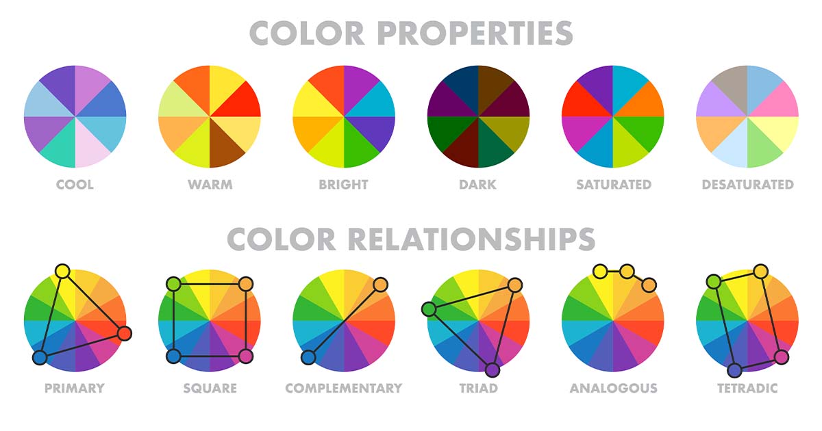
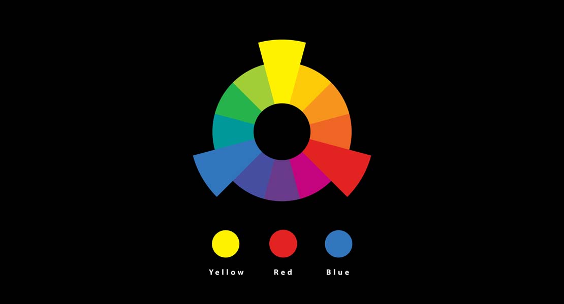
Color wheel is a kind of basis for color theory, which presents all colors in a circular, systematic way to reveal their relationships with one another. This includes
Primary Colors: Red, blue and yellow. Can’t be made by mixing any other colors.
Secondary Colors: Green, orange and purple. They are made by mixing two primary colors
Tertiary Colors: Colors made by mixing secondary and primary color, such as red-orange and blue-green. Knowing the connection between colours on the wheel, designers create harmonious mixes and avoid jarring color schemes.
Types of Color Harmonies
One of the main objectives of color theory in graphic design is the purpose of acquiring harmonies. Harmonies refer to aesthetically pleasing compositions of colors. Some of the most commonly used harmonies include:
1. Complementary Colors
Complementary colors are those that lie directly opposite each other on the color wheel. For example, blue and orange, red and green, or any other complementary color. Such contrast shall create energetic designs that attract people’s attention.
When to Use:
Complementary colors are great for call-to-action buttons, headlines, and anything that needs to stand out.
2. Analogous Colors
Colors that are next to each other on the color wheel are analogous colors, including blue, teal, and green. These hues are soothing and harmonious and tend to work best in designs that have to communicate calmness, unity, and peacefulness.
When to Use:
Analogous colors are great to use in the background, branding, and layouts where subtlety is important.
3. Triadic Colors
Triadic color schemes are three colors equidistant from one another on the color wheel, like red, yellow, and blue. This combination gives a harmonious but lively palette.
When to Use:
The triadic scheme is ideal in playful or creative design, especially in children’s branding or art-related projects.
4. Monochromatic Colors
A monochromatic scheme employs different versions of a single color with variations in value and saturation to achieve depth and contrast.
When to Use:
Monochromatic designs are generally preferred for minimalist or professional applications, including corporate branding.
Color Psychophysics
Colors influence emotions and perceptions. For years, marketers and designers have explored the role of color in human psychology. Ultimately, this led to the branch of design called color psychology.
Here is a quick overview of common emotional and conceptual associations with colors:
Color=Emotion or Concept
Red=Passion, energy, urgency, power.
Orange=Optimism, warmth, creativity, enthusiasm.
Yellow=Happiness, intellect, caution, brightness.
Green=Growth, harmony, health, ambition.
Blue=Trust, calm, professionalism, confidence
Purple=Luxury, imagination, elegance, mystery
Black=Sophistication, authority, mystery, power
White=Simplicity, purity, cleanliness, safety
Use in Marketing and Branding
Red is associated with use in urgency-type sales promotions
Blue is a trustworthy color. It is used very much in corporate and financial brands.
Green represents growth. In fact, it has become the most prominent color in health and eco-friendly brands.
By understanding these associations, designers can make decisions that best suit their project’s intent.
Color Theory in Branding and Identity Design
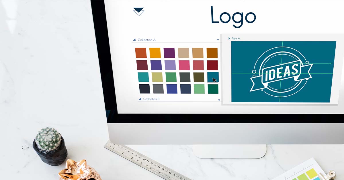
Color is one of the most potent tools for creating brand identity. Consider iconic brands like Coca-Cola (red), Facebook (blue), or Starbucks (green). Their choices are not made lightly: each color helps to elicit a particular emotional response and become familiar.
Best Practices for Branding with Color
Be Consistent:
Maintain a clearly defined color palette across all branding elements so that the message is uniformed.
Know Your Audience:
Research your target demographic and cultural context to choose colors that resonate with your audience.
Highlight calls-to-actions like buttons, links in a bold or contrasting color to get users to act.
Practical Applications of Color Theory
Color theory applies to every design aspect, from the layout of an image to an advertisement. Here are some practical applications to integrate color theory into your work
1. Cultural Sensitivity
Colors have different meanings across cultures. For example:
White symbolizes purity in Western cultures but mourning in some Asian cultures.
Red represents good luck in China but caution or danger in Western societies.
2. Accessibility
Make sure that the design is accessible by thinking of color blindness and visual impairments. Tools like Contrast Checker can help to choose accessible combinations of colors.
3. Avoid Overloading with Colors
Stick to a limited palette to maintain focus and avoid overwhelming your audience. A general rule of thumb is to use three to five colors in a design.
Advanced Concepts in Color Theory
Once you’ve mastered the basics, explore more advanced techniques to elevate your designs:
Split Complementary Schemes
One of the variations of complementary colours, split complementary schemes employ a base color and two adjacent to its complement. This adds complexity while still being balanced.
Using Neutral Colors
Use neutral tones such as gray, black, or white to ground your work and allow the more vibrant colors to be showcased.
Working with Gradients
Blend two or more colors to create gradients to provide depth and modernity to your visual effects.
Tools and Resources for Understanding Color Theory
Graphic designers can take advantage of the following tools to research and implement color theory:
Adobe Color : Create palettes and discover trending color combinations.
Canva Color Wheel : A beginner-friendly tool to create harmonious schemes.
Colour Hunt : Browse and download curated color palettes.
Contrast Checker : Make sure that your designs meet the demands of accessibility standards.
Conclusion
Color theory should be mastered by every graphic designer as a means of achieving meaningful, impactful, and aesthetically pleasing designs. Understanding the basics of color and how to utilize its psychological powers in practical application can make your work much richer and more effective in terms of reaching your audience.
Whether it is building a brand, designing a website, or creating an advertisement, the correct use of color can be the deal-maker. Go ahead, explore and experiment with the mighty power of color on your designs.
Click here to explore “The Ultimate Guide to Color Theory: Mastering the Art of Graphic Design”


Zaryab is a dynamic Media Team Manager specializing in graphic design and digital marketing. With proven expertise in Facebook organic growth, Meta Ads Manager, TikTok Ads, LinkedIn optimization, Google Ads, on-page SEO, blogging, and copywriting, Zaryab crafts impactful strategies to elevate brand presence and drive results.

One Comment:
The Ultimate Guide to Typography | thezzs 2025
[…] Click here to dive into “A Comprehensive Guide to Color Theory in Graphic Design.” […]